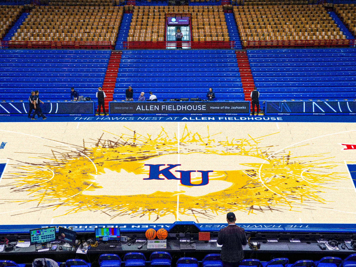
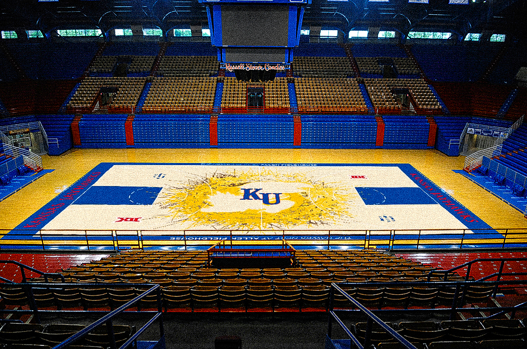
you'd think I'd be able to find better pictures of Allen Field house going to KU...
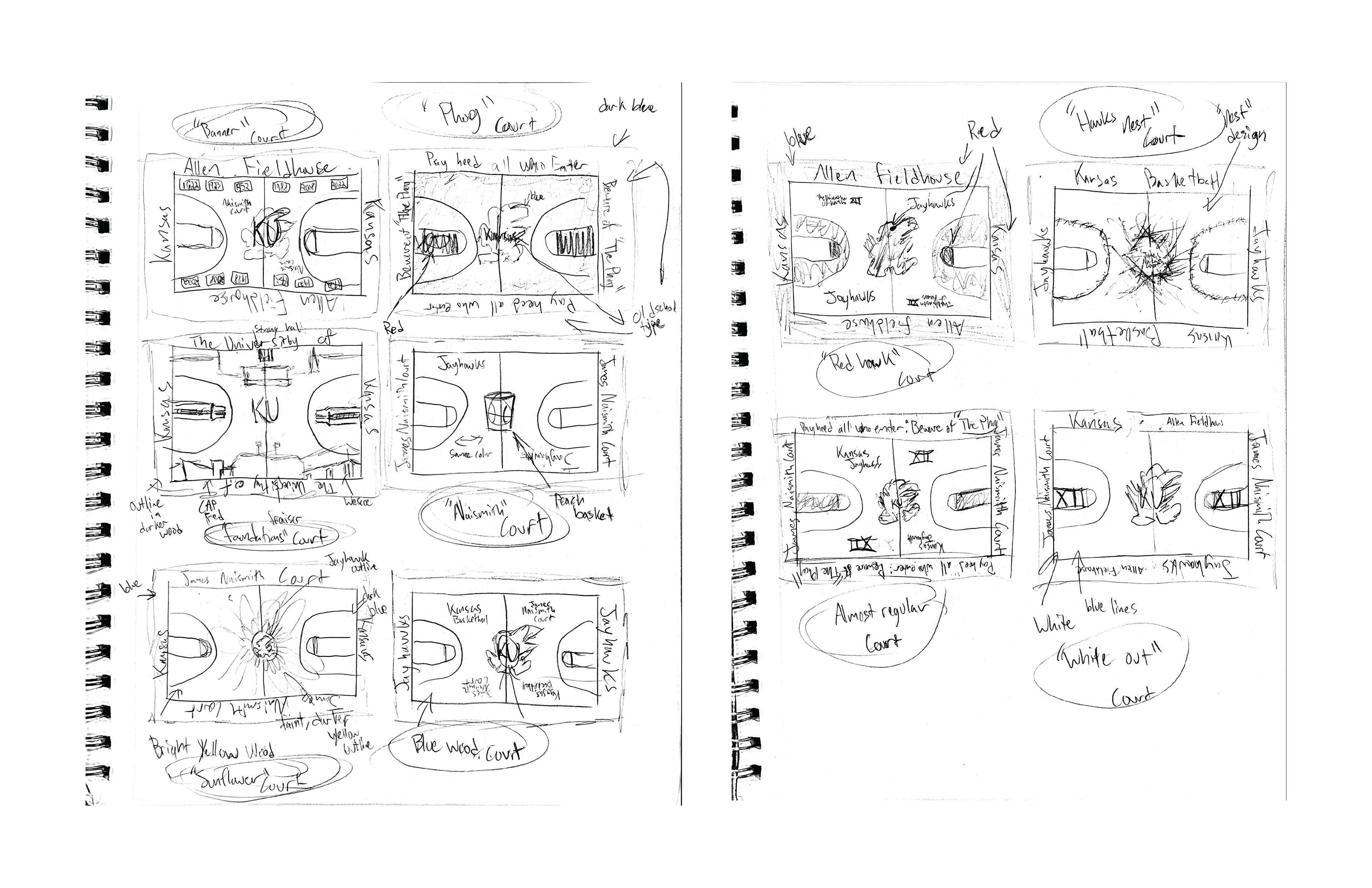
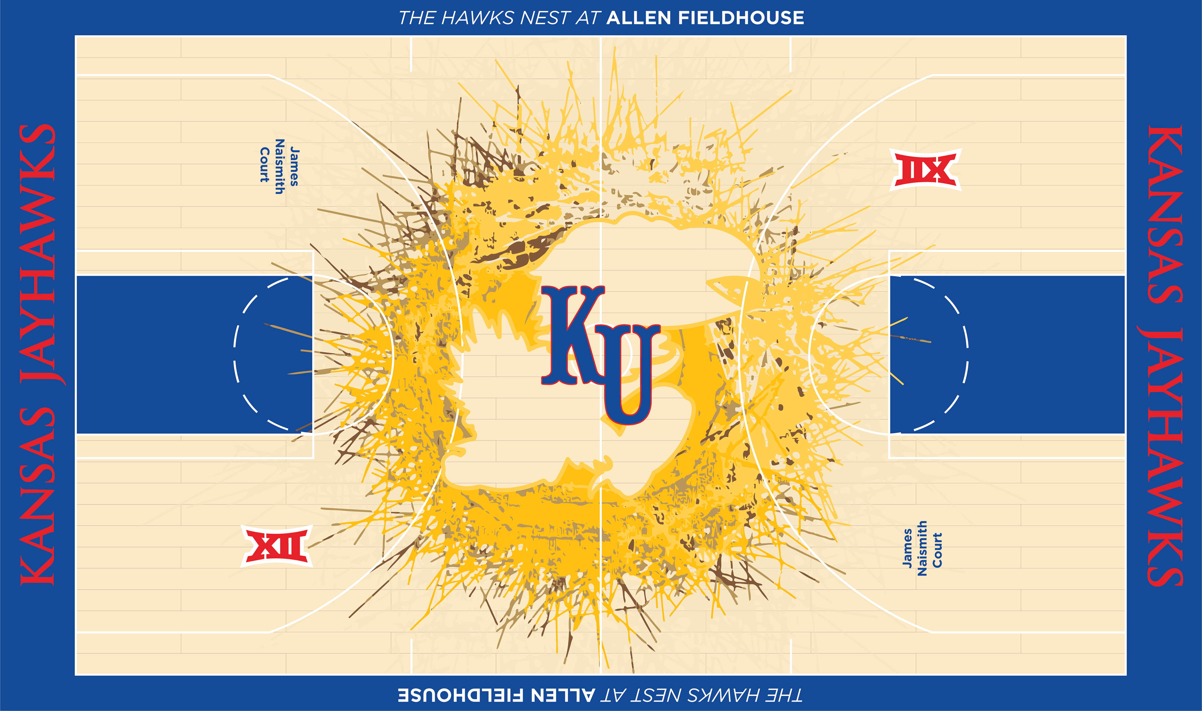
Final Design
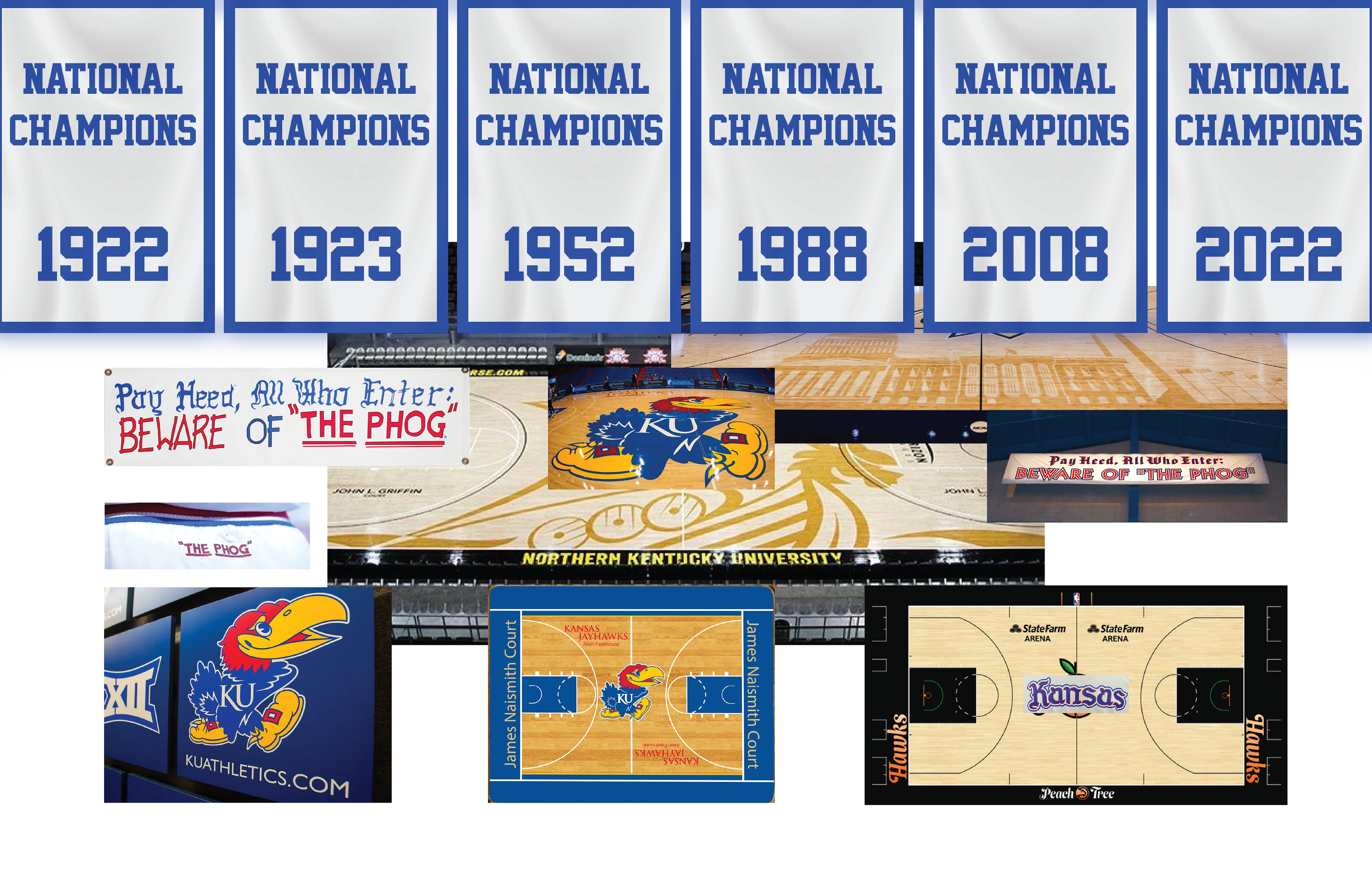
Moodboard
KU's Environmental Graphics course Taught me a lot about designing within physical spaces. The interaction between graphics and the audience in the real world is immensely important, graphics often serving as locational markers and tools of communication that guild people though a space. when done well, it is seamless with the function of the space itself.
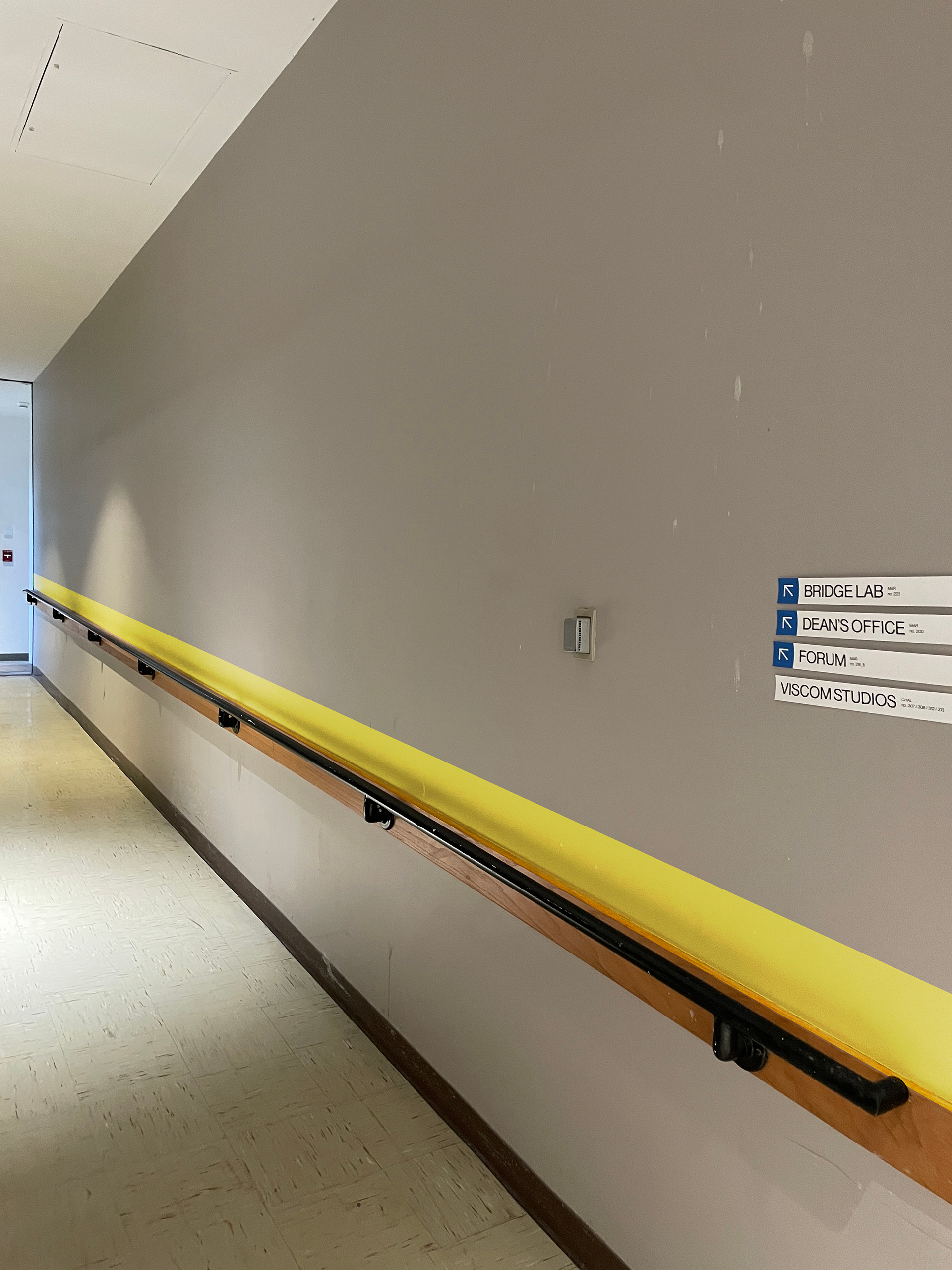
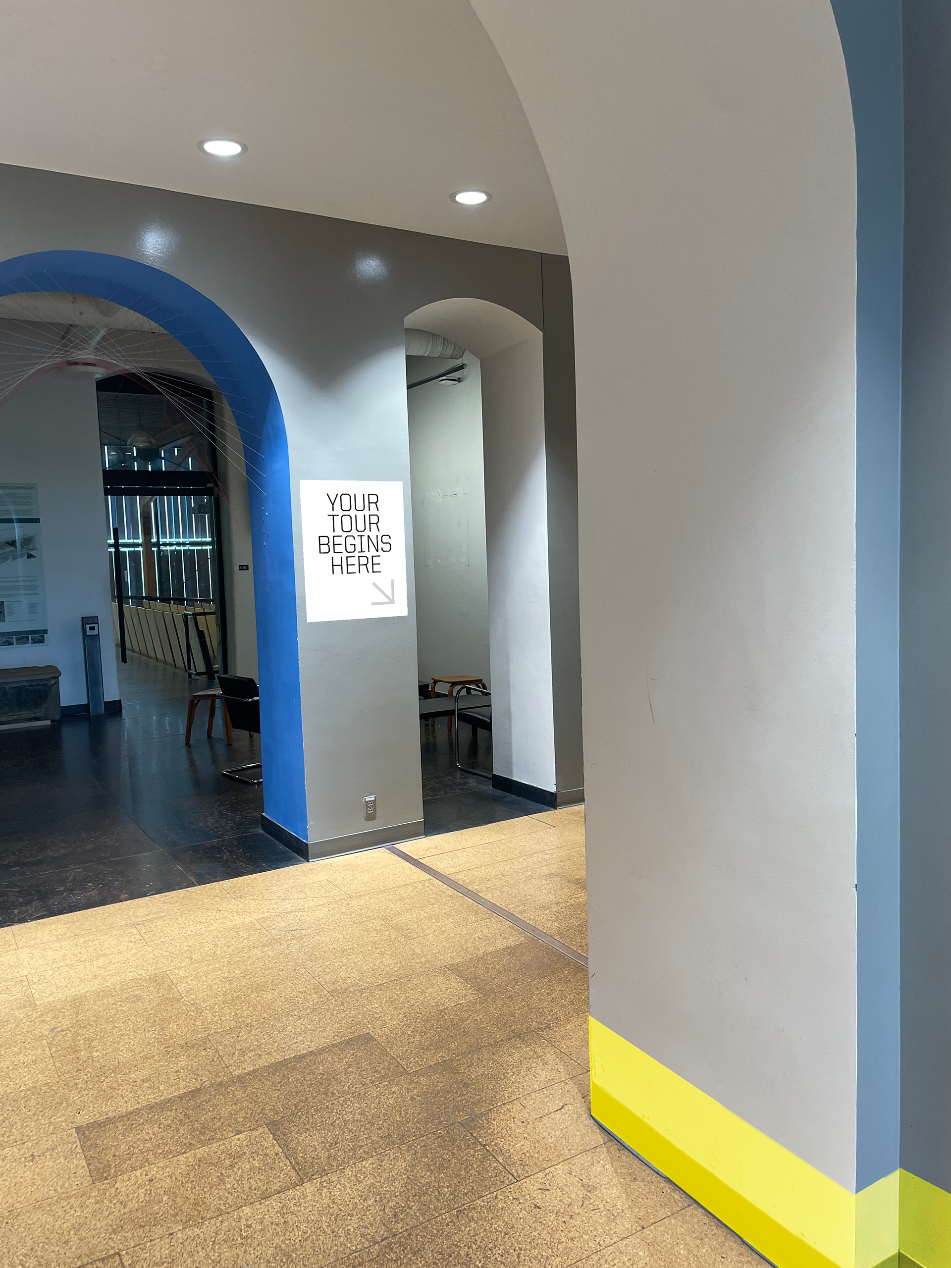
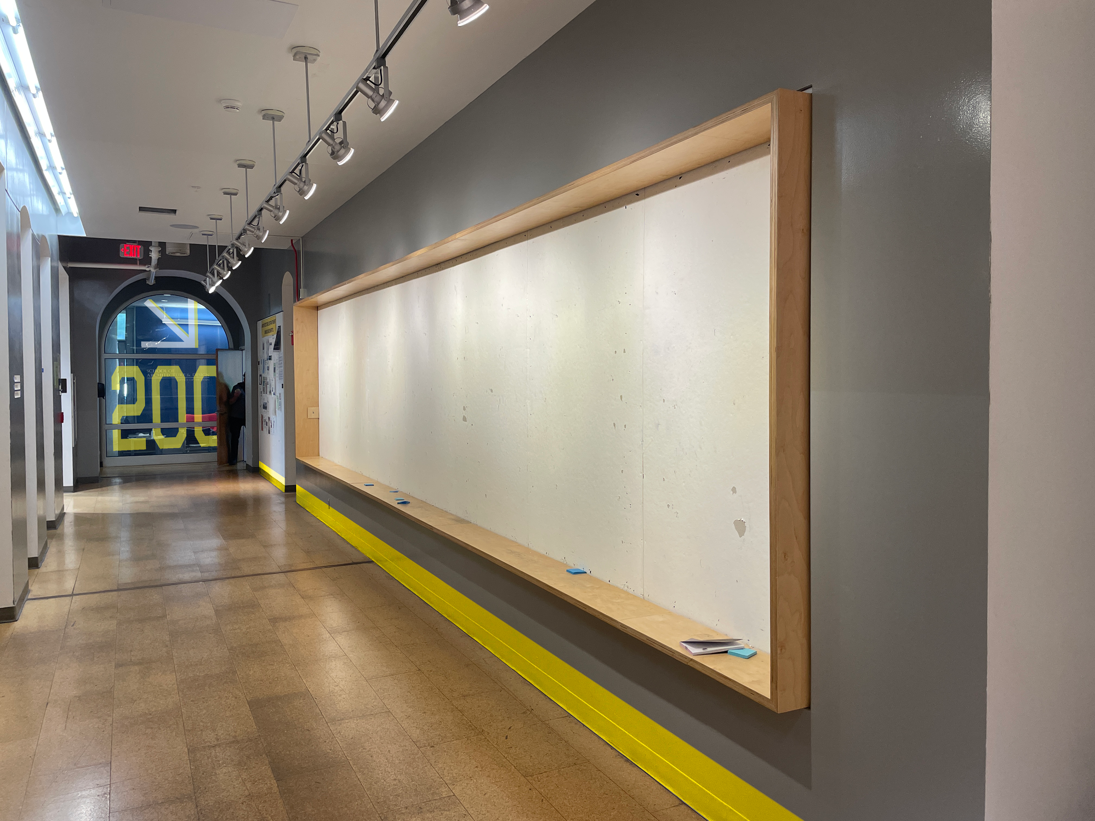
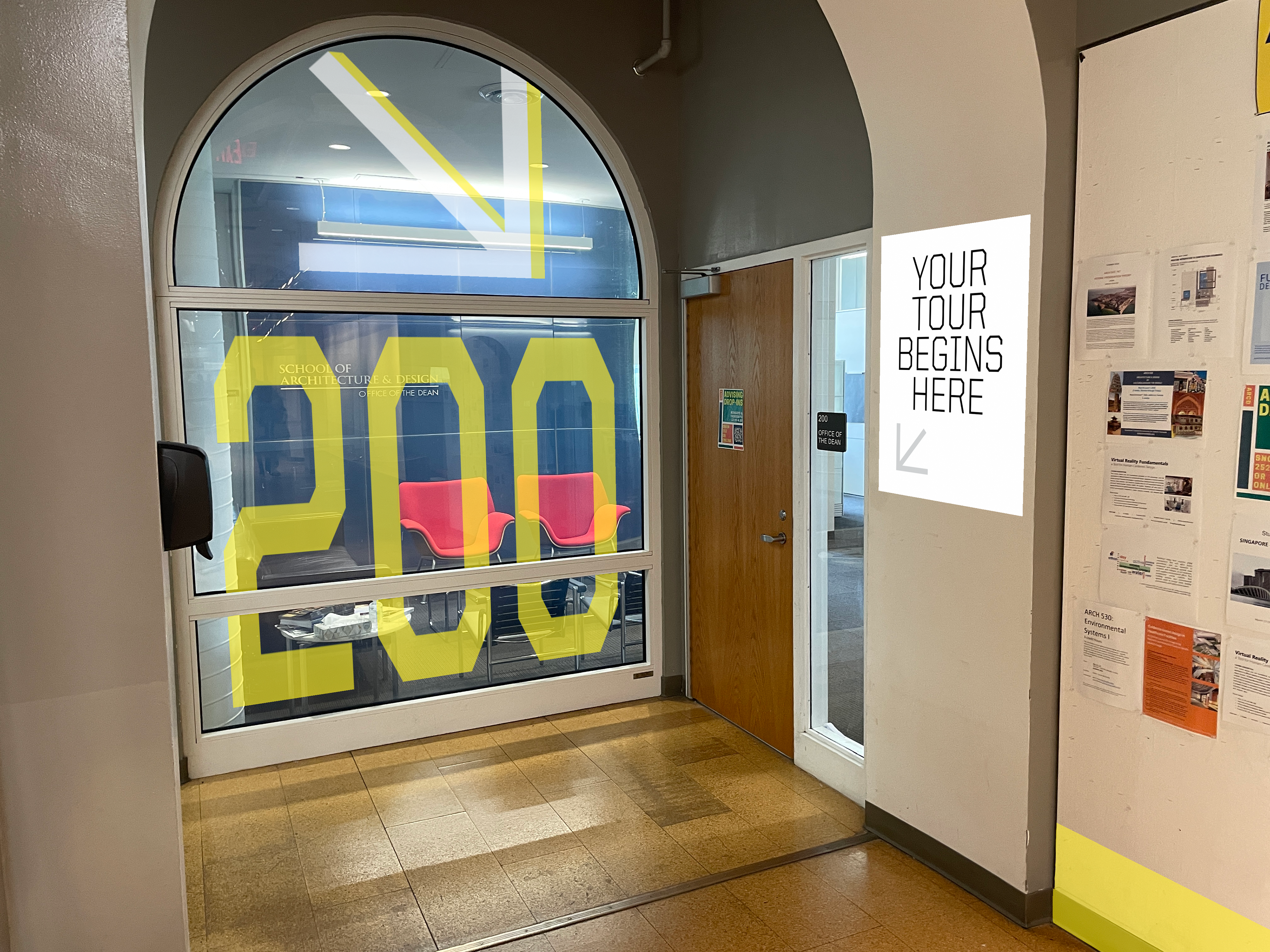
How can we lead tour attendees here?
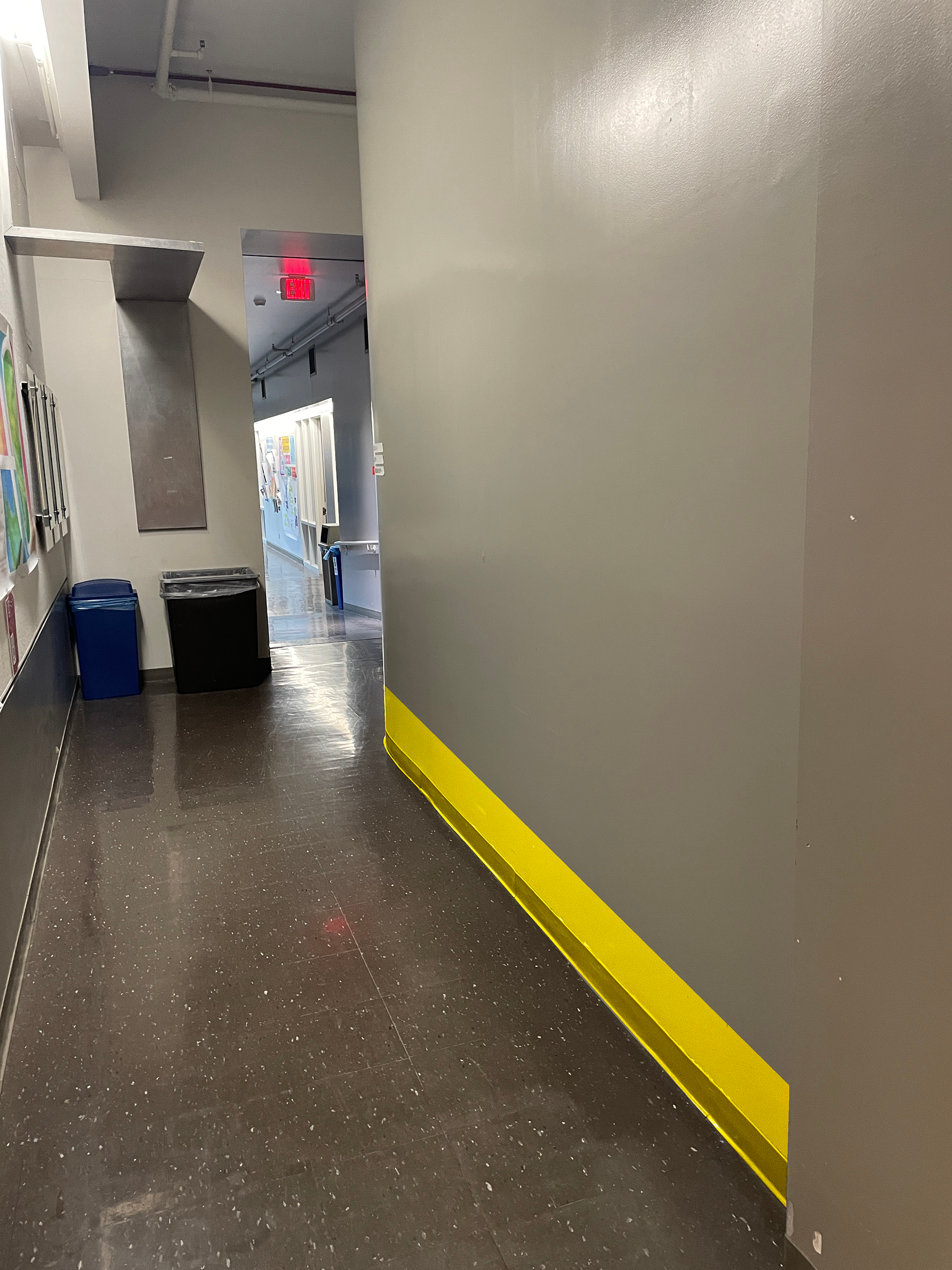
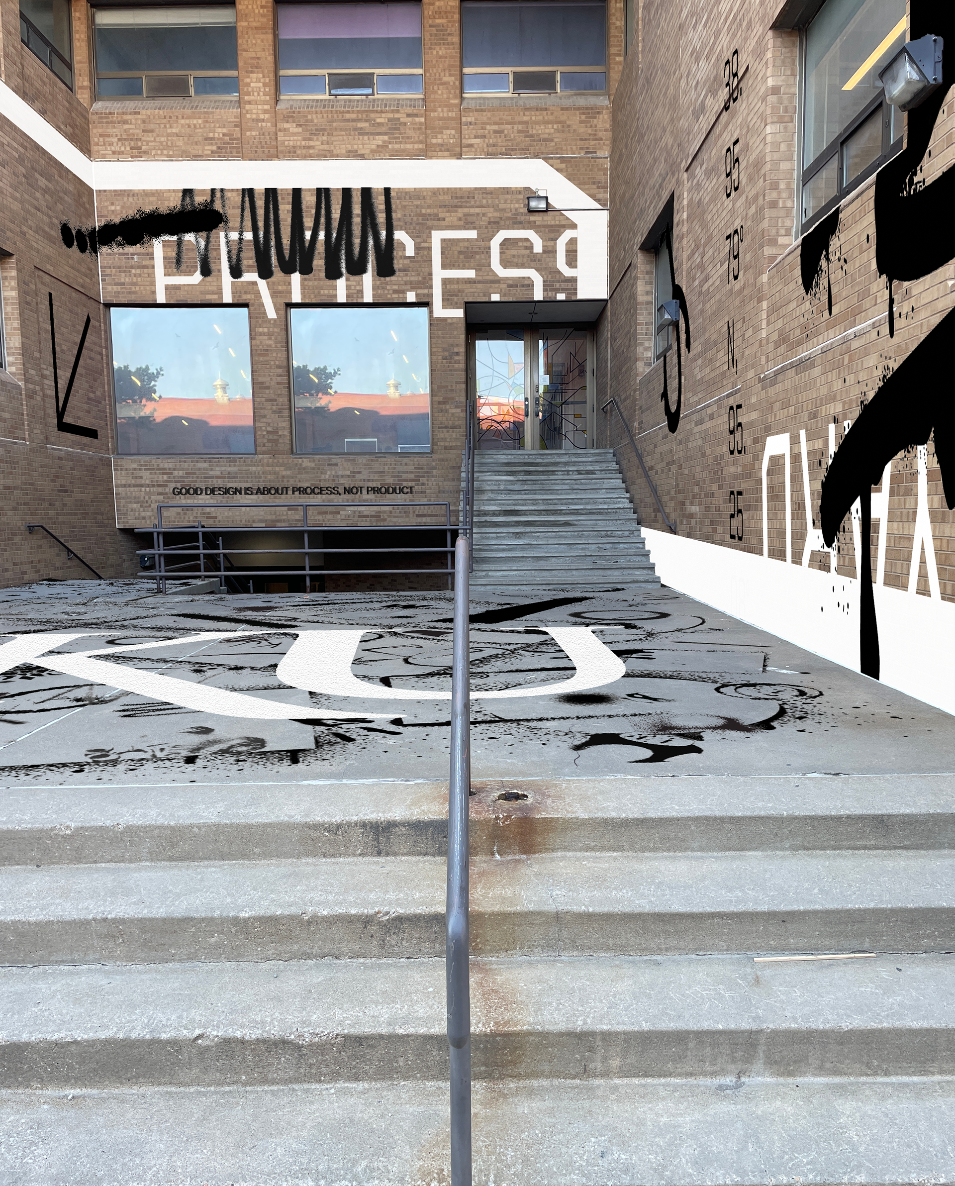
The different projects has us thinking about the unique aspects of our design building and what kind of graphics could enliven/enhance the character of it, while maintaining function. One specific need is a way to make room Marvin 200 easily found from the many confusion entrances to either building; my solution's above!
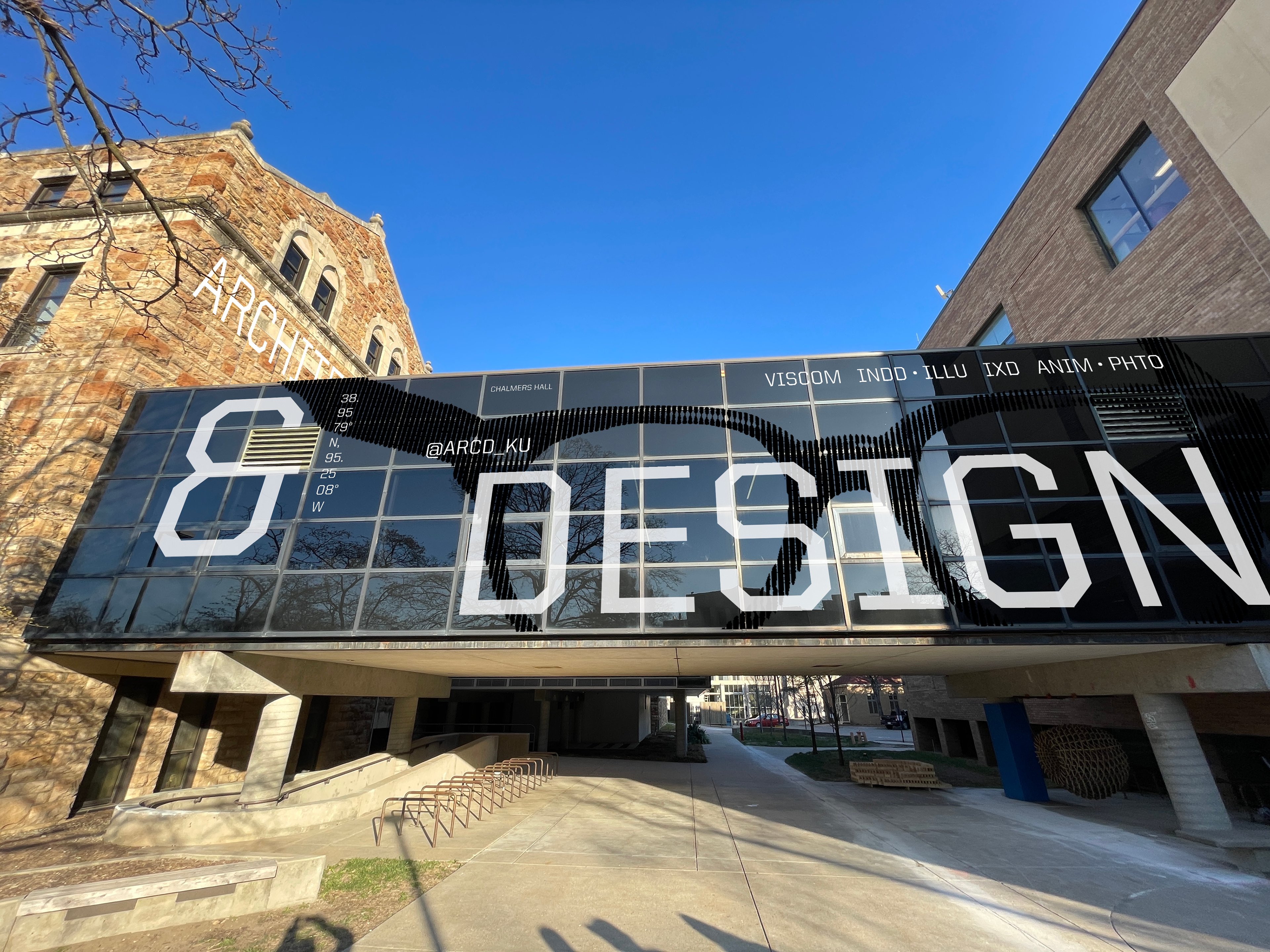
Chalmers Bridge is really characteristic of the separation in "ArcD"
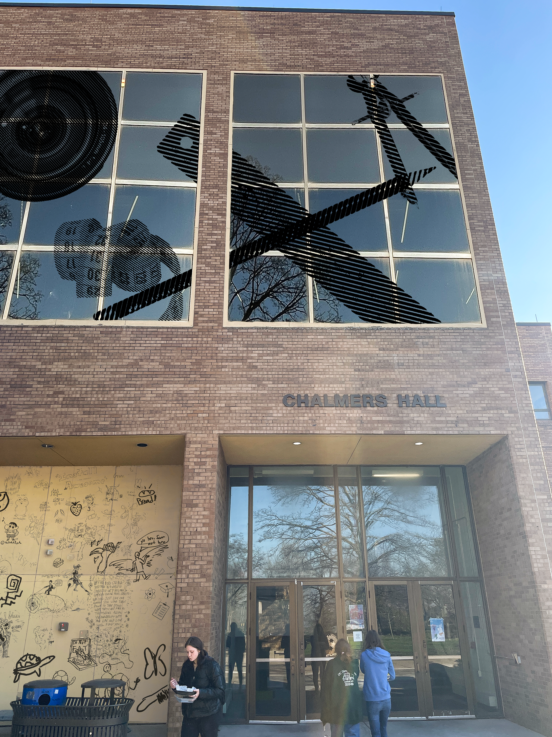
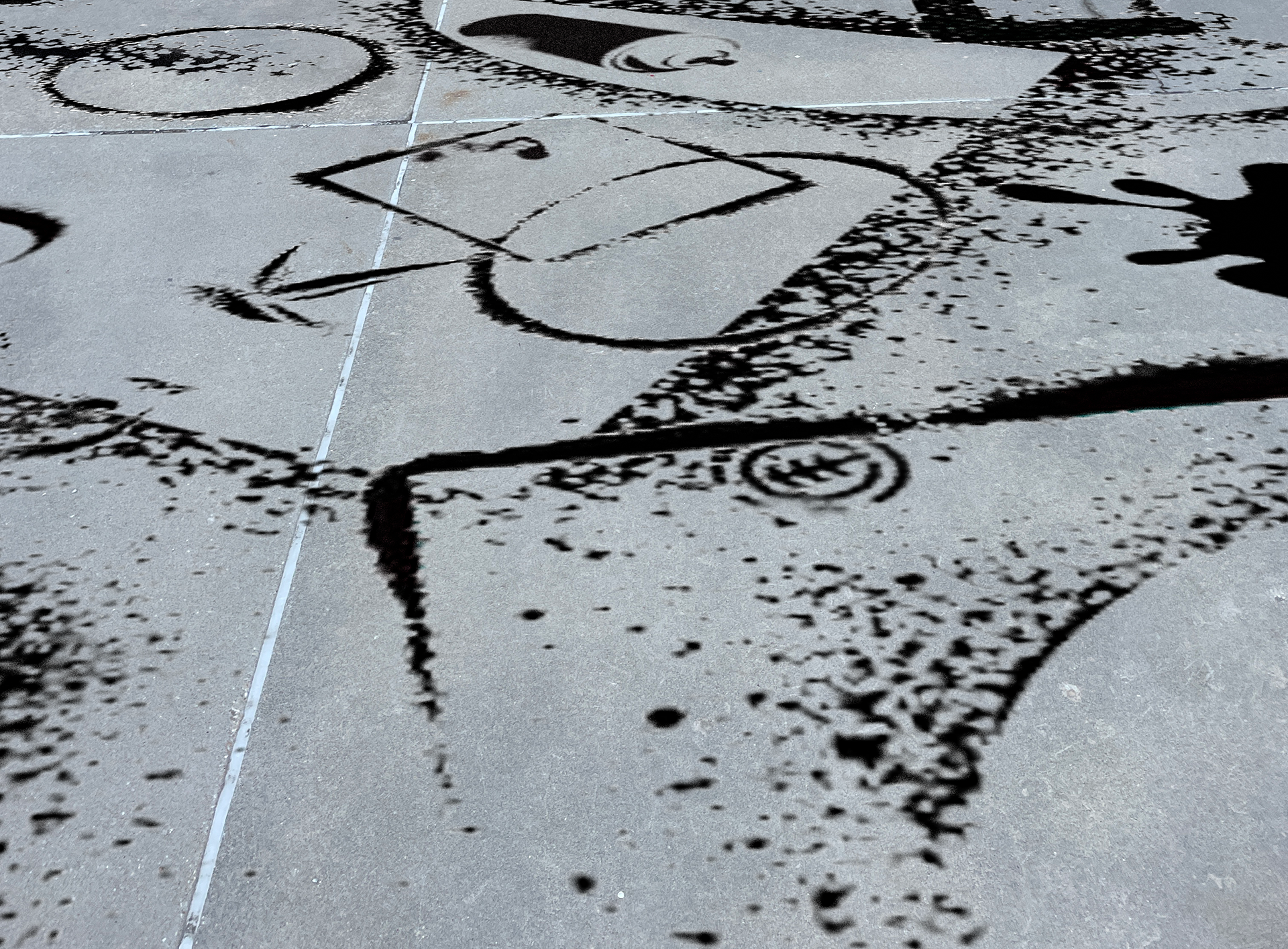
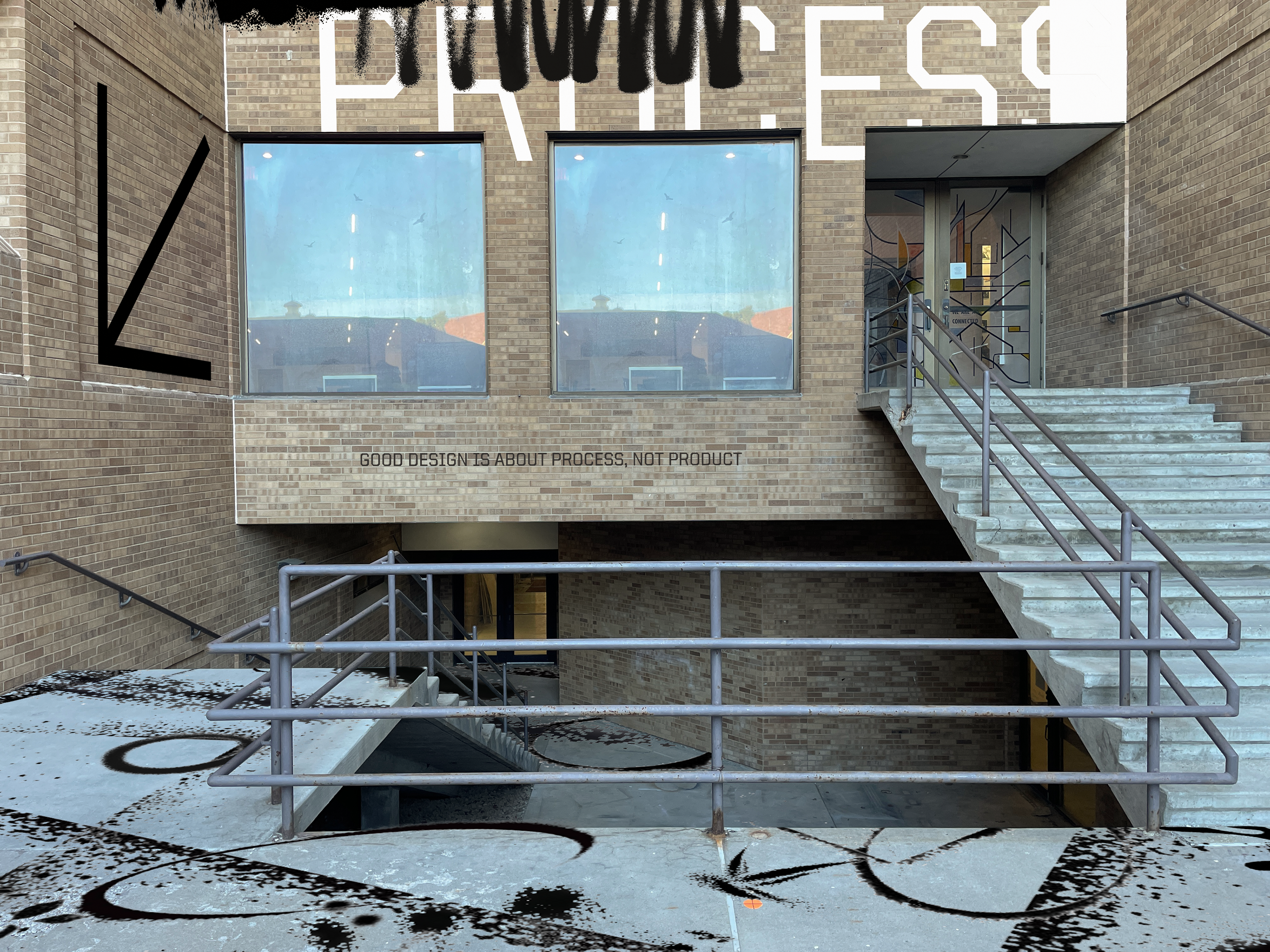
The "Process Yard" could be a space where students don't have to be afraid to let the mess of process flow.
A way our school can stand out from above!
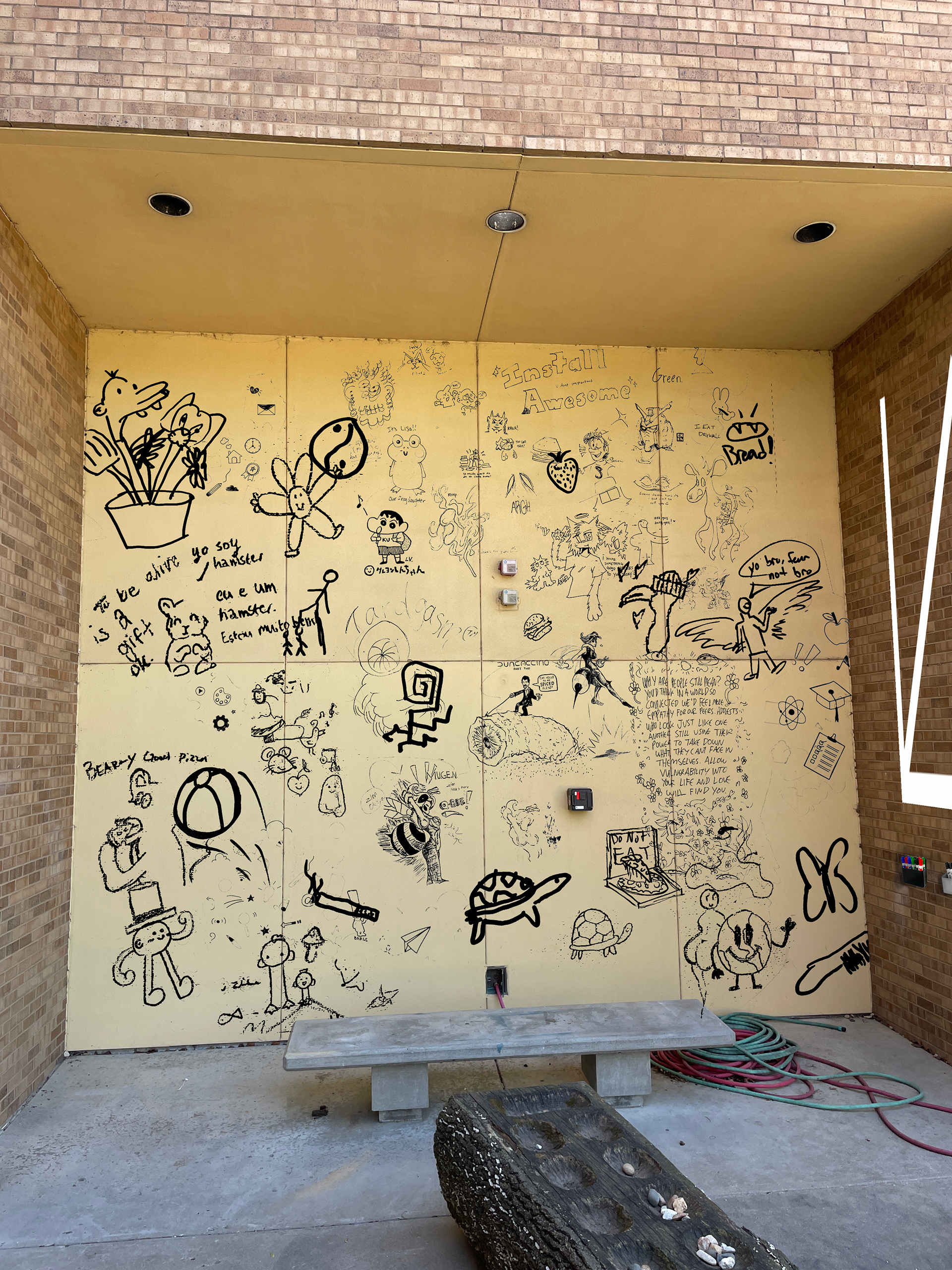
Adding a sketch wall outside would be fun! We're always doodling anyway...
Chalmers hall, its innovation, unique layout, and dedication to proving a space to learn design is something i thought should be emphasized, especially our building being shoved behind the Architecture school's Marvin Hall. A project allowing us to imagine graphics on the exterior of the building lead to me rethinking how we underutilize these spaces outside the hall.
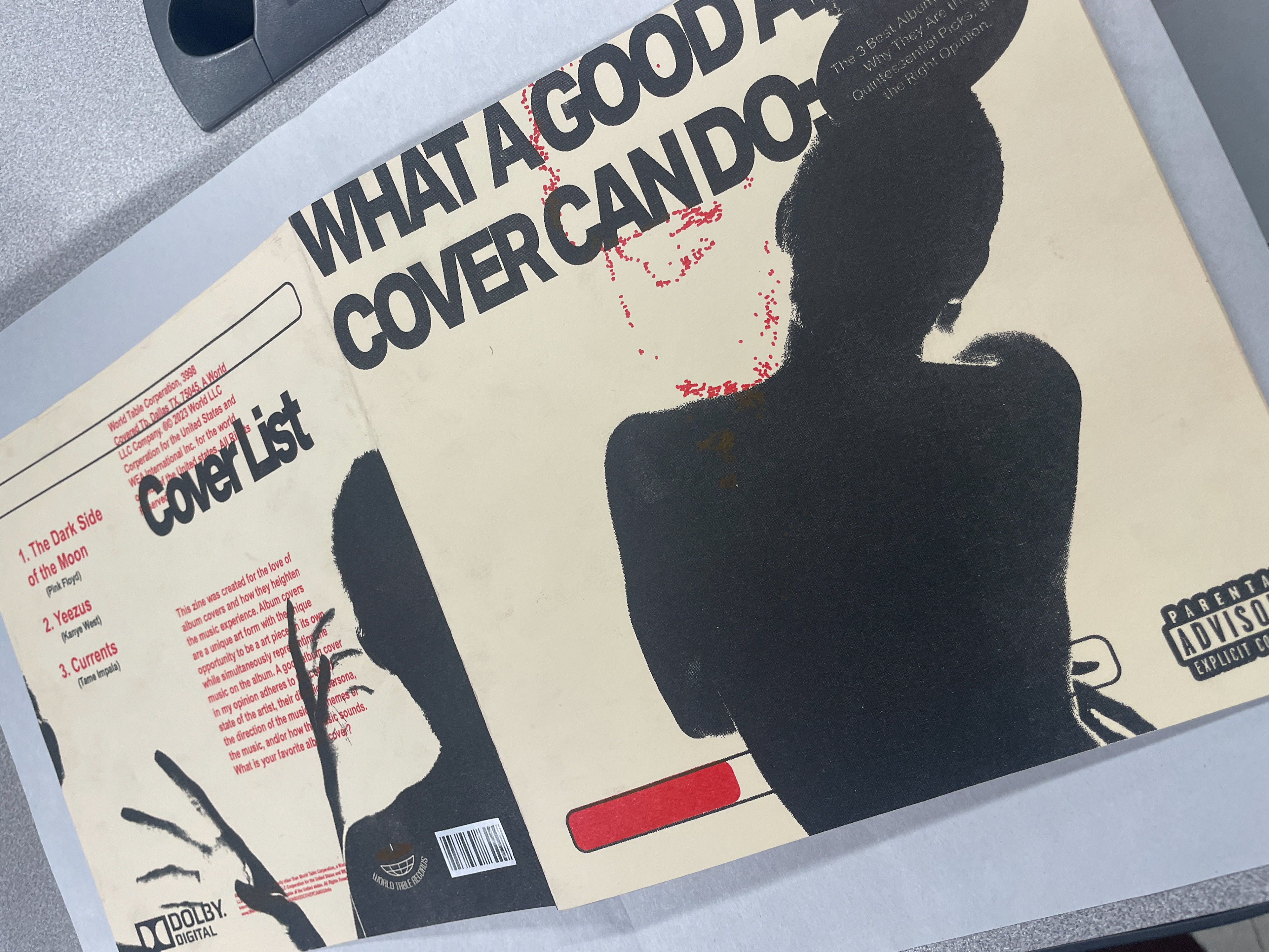
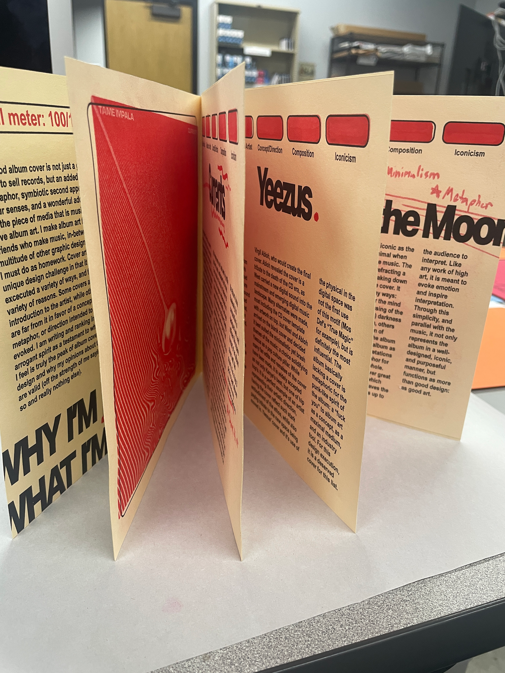
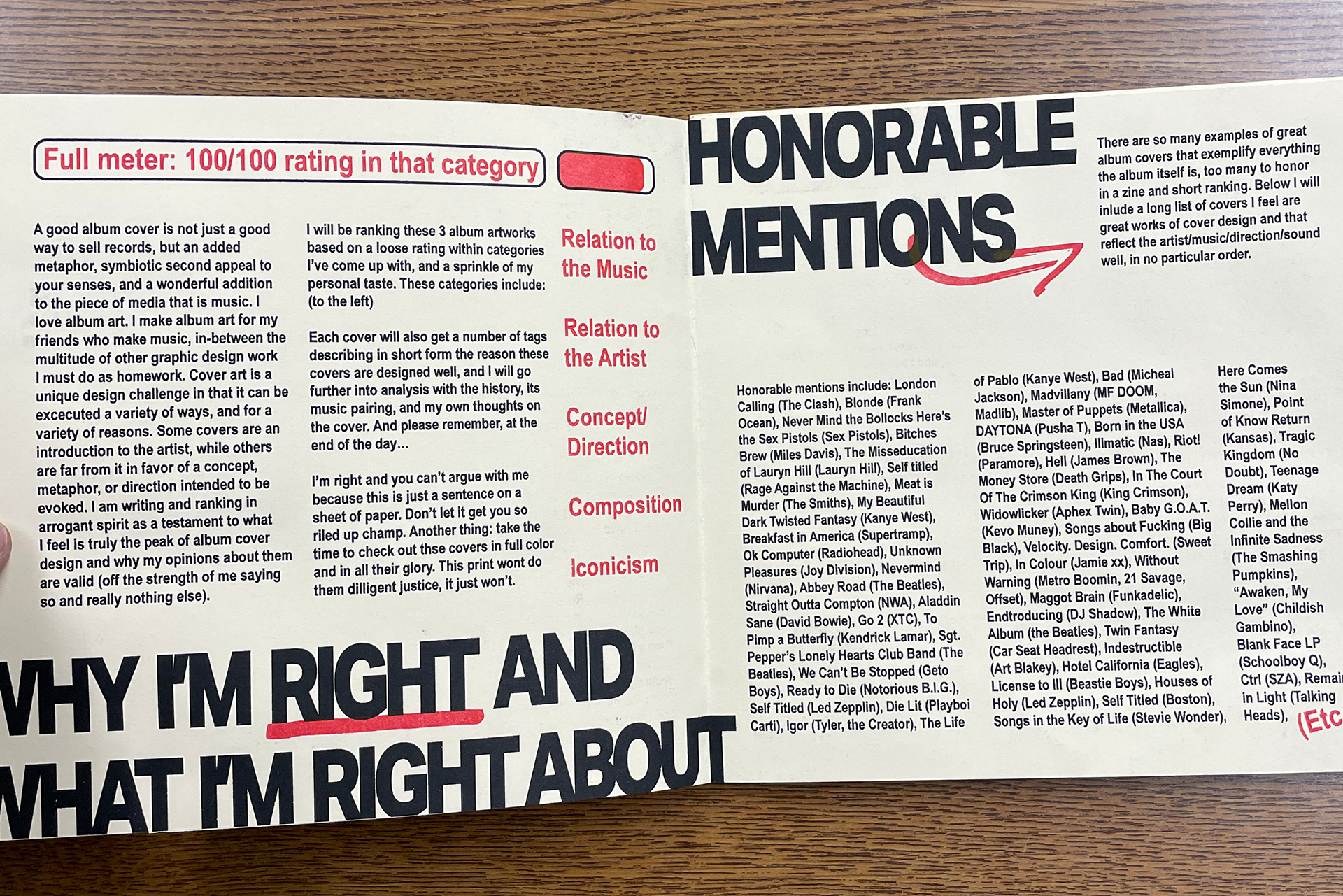
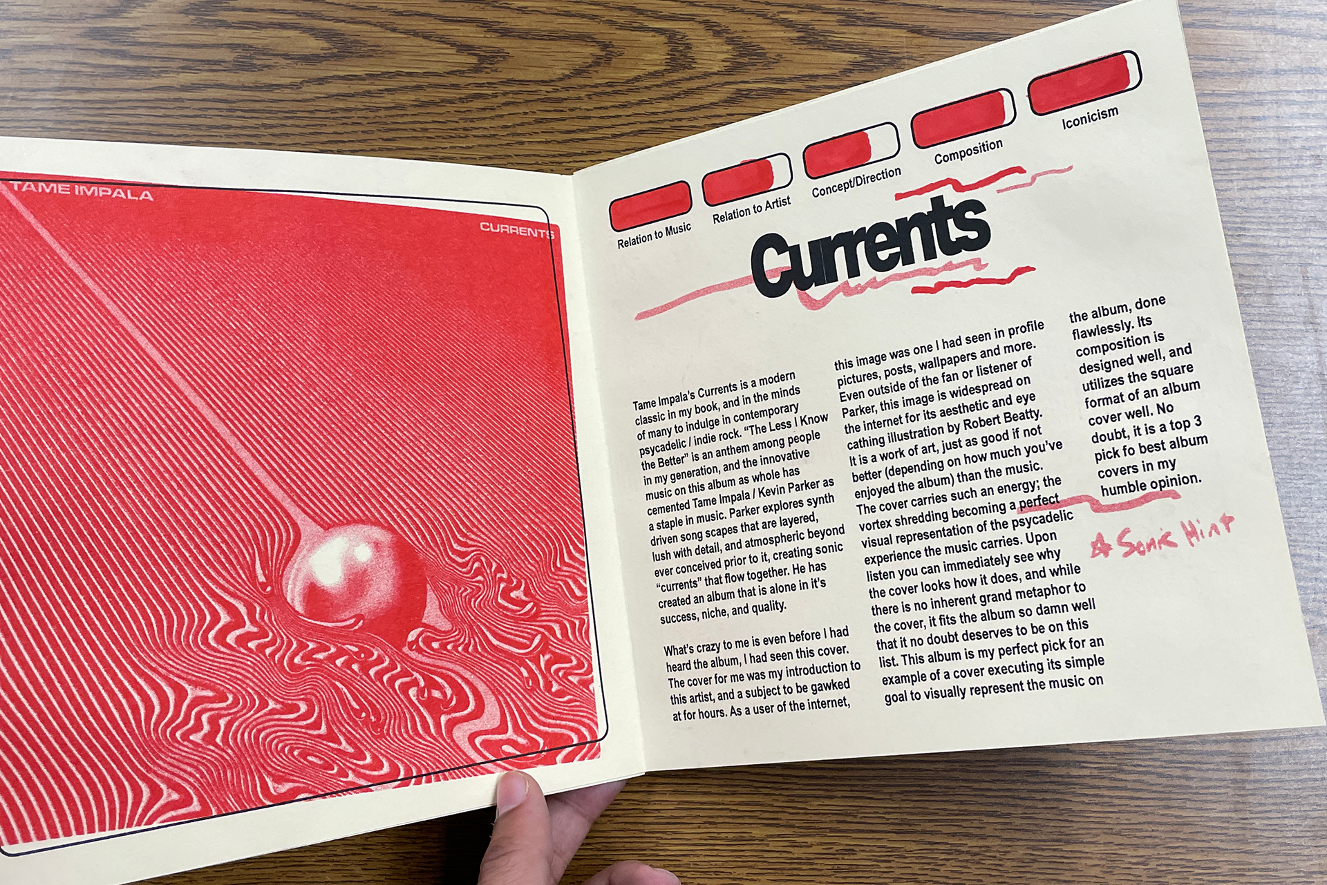
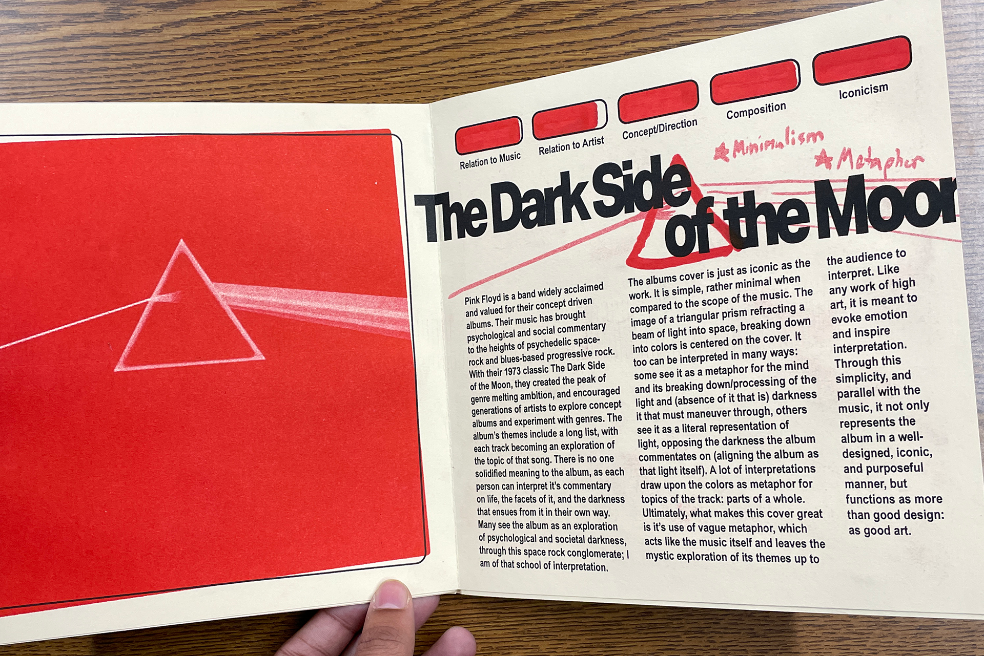
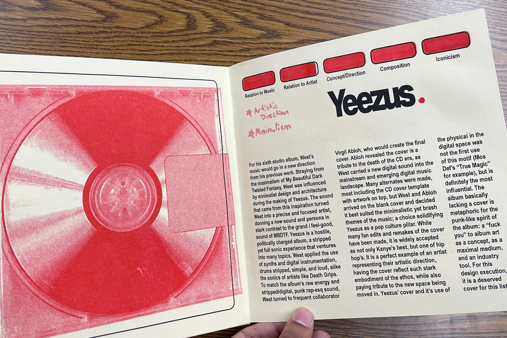
getting into other cool projects, This is a RISO printed zine centered around my love for album covers. originally a top 10, I had to consolidate for the sake of the project, but my honorable mentions list is long!
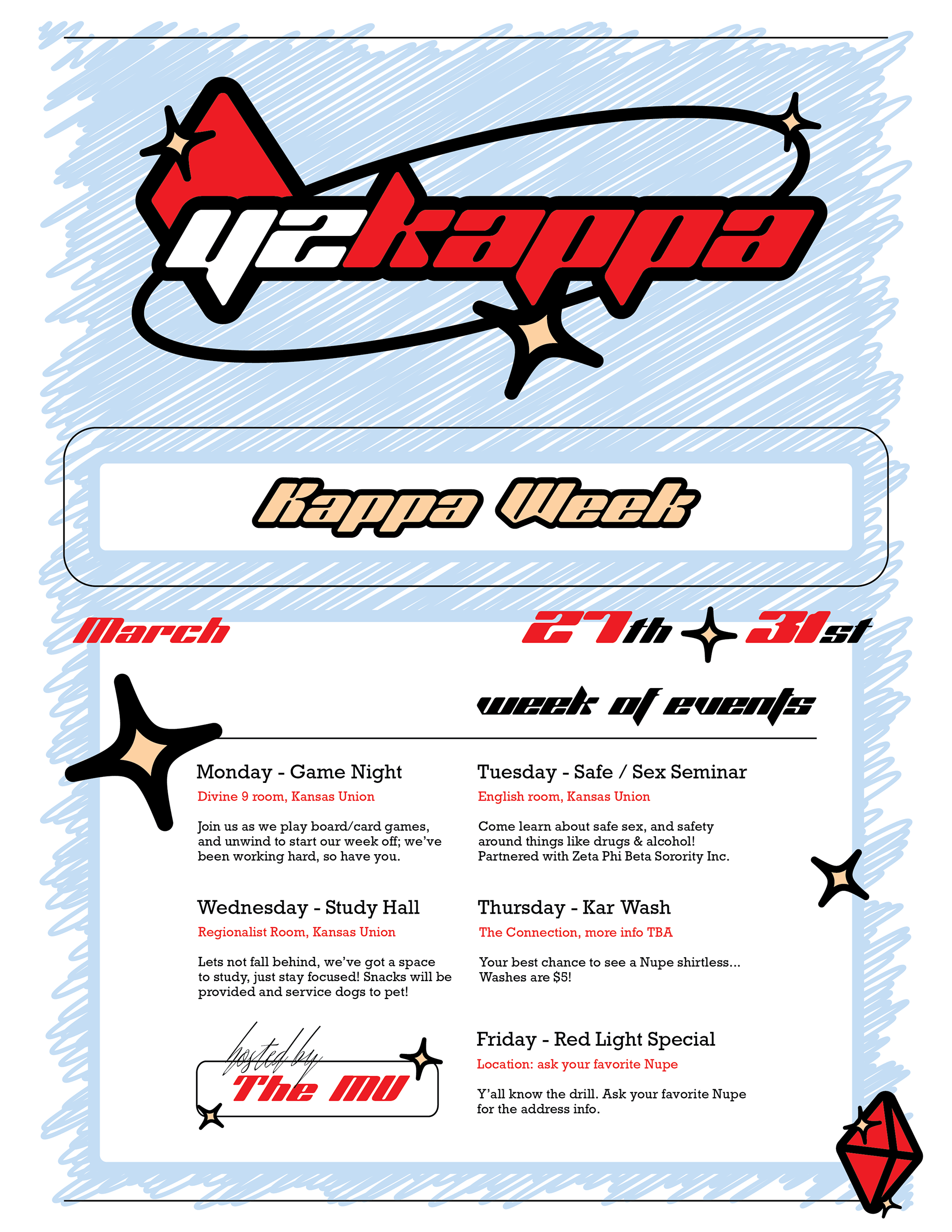

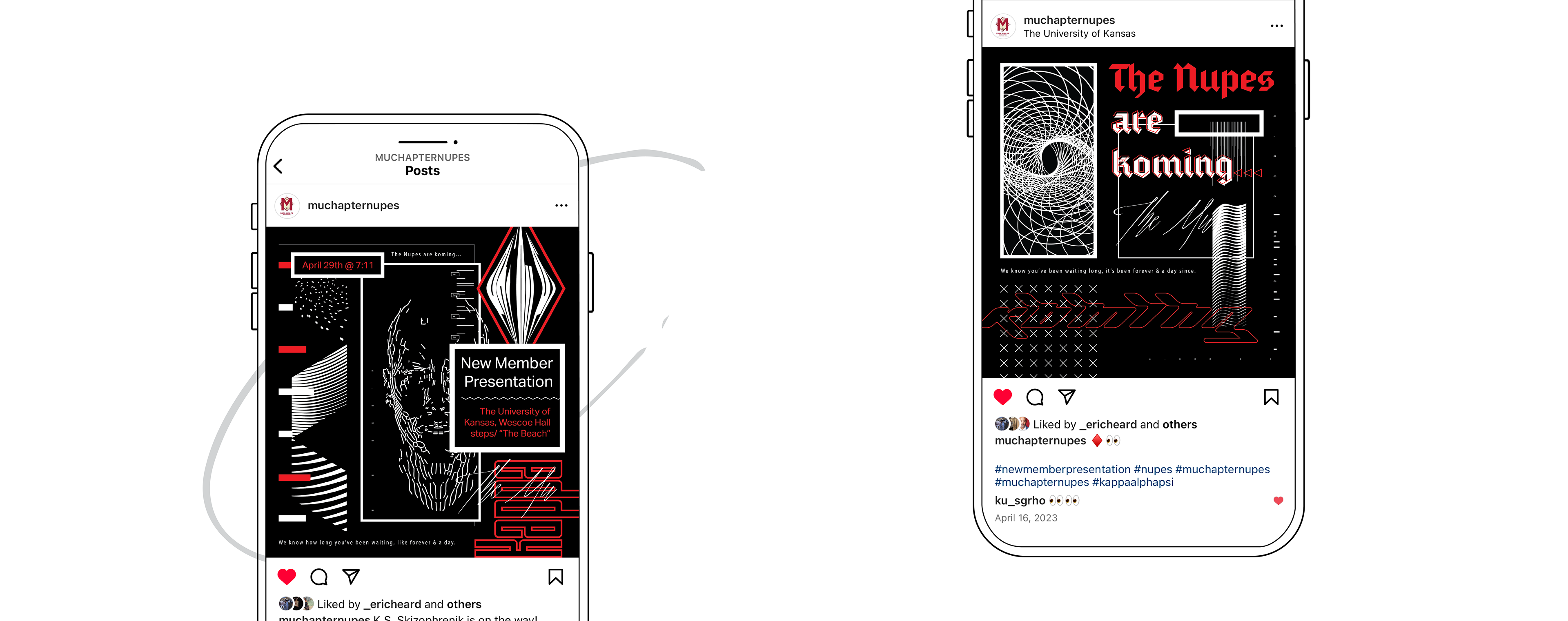
looking back there's always things you'd want to change or make better, but my time designing for my fraternity was invaluable to me, learning to find the intersection between style and function. Trying to emulate low fidelity designs from decades ago while maintaining some quality was challenging!
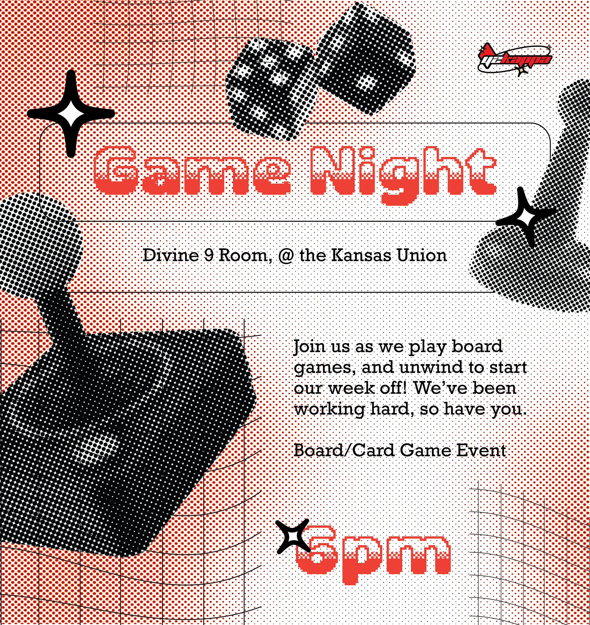

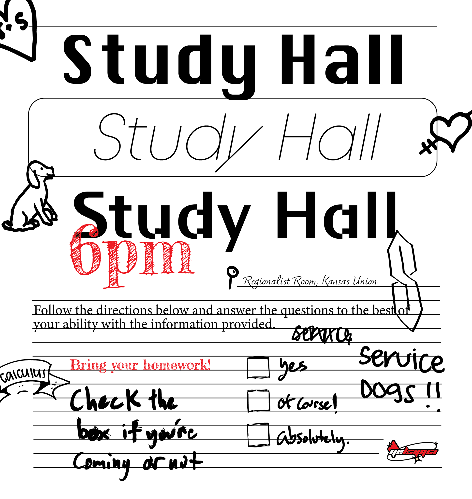
Asked myself: how much clutter and sketchy elements could we get away with?
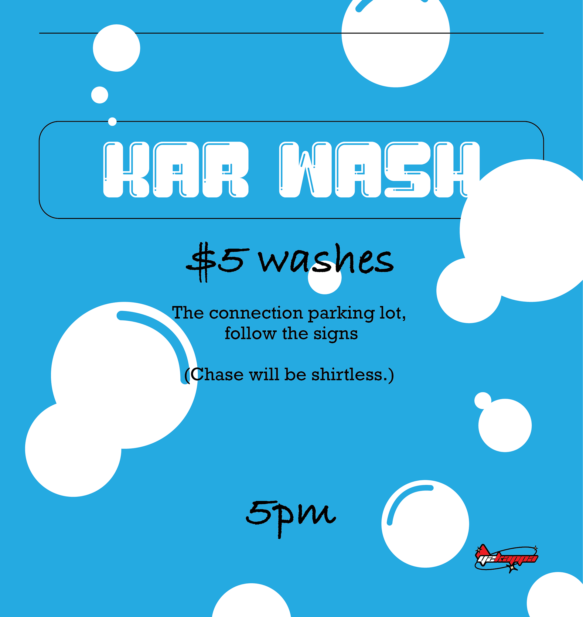
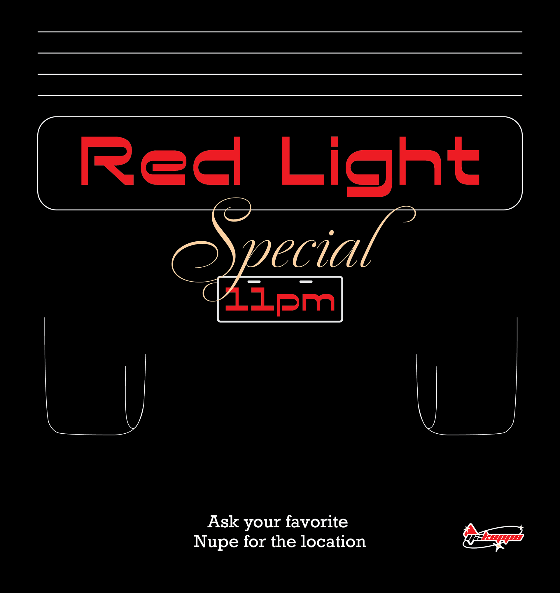
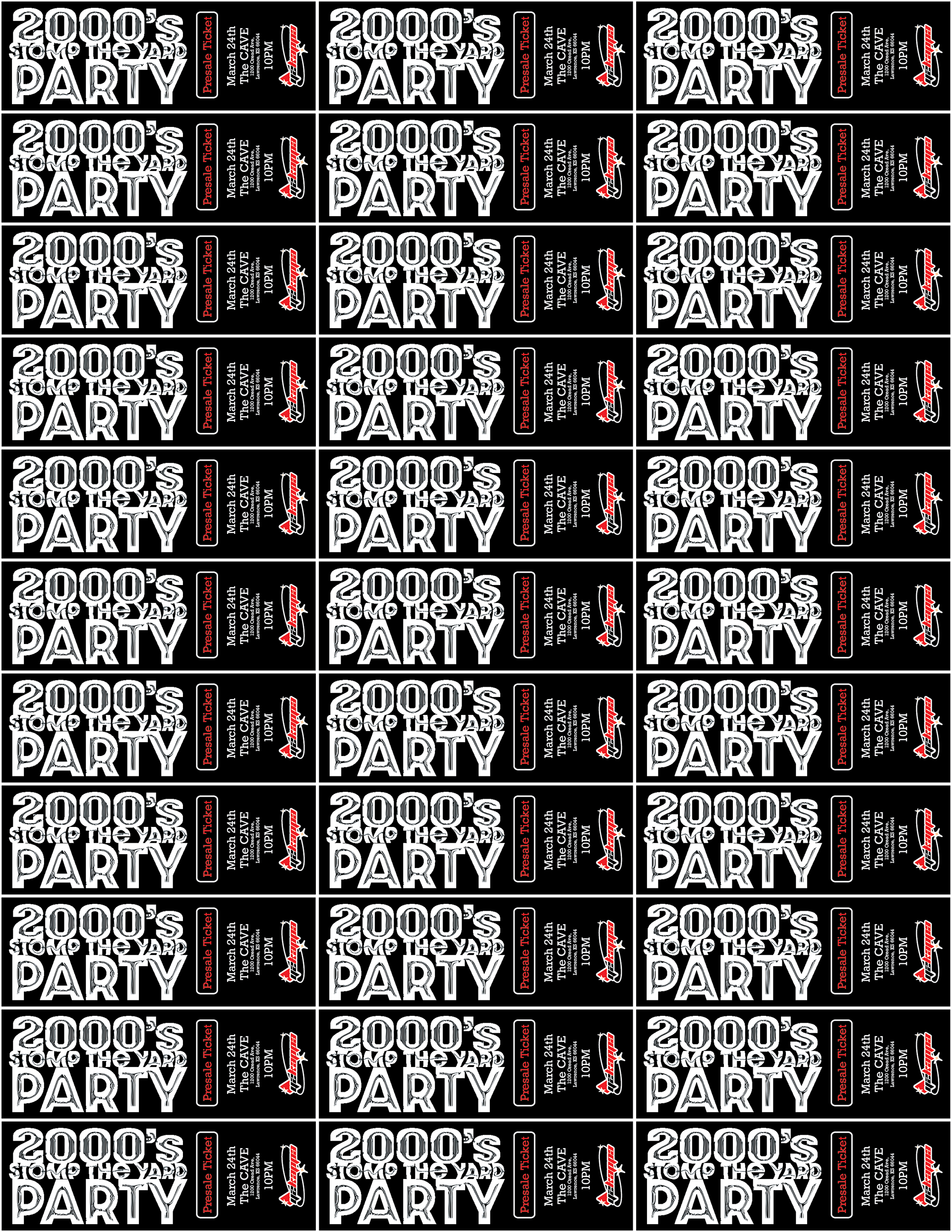
This project for Kappa Week 2023 was cool for a number of reasons, but mostly because i got to design and print tickets! theres nothing i love more than seeing a design in the place it was intended for.
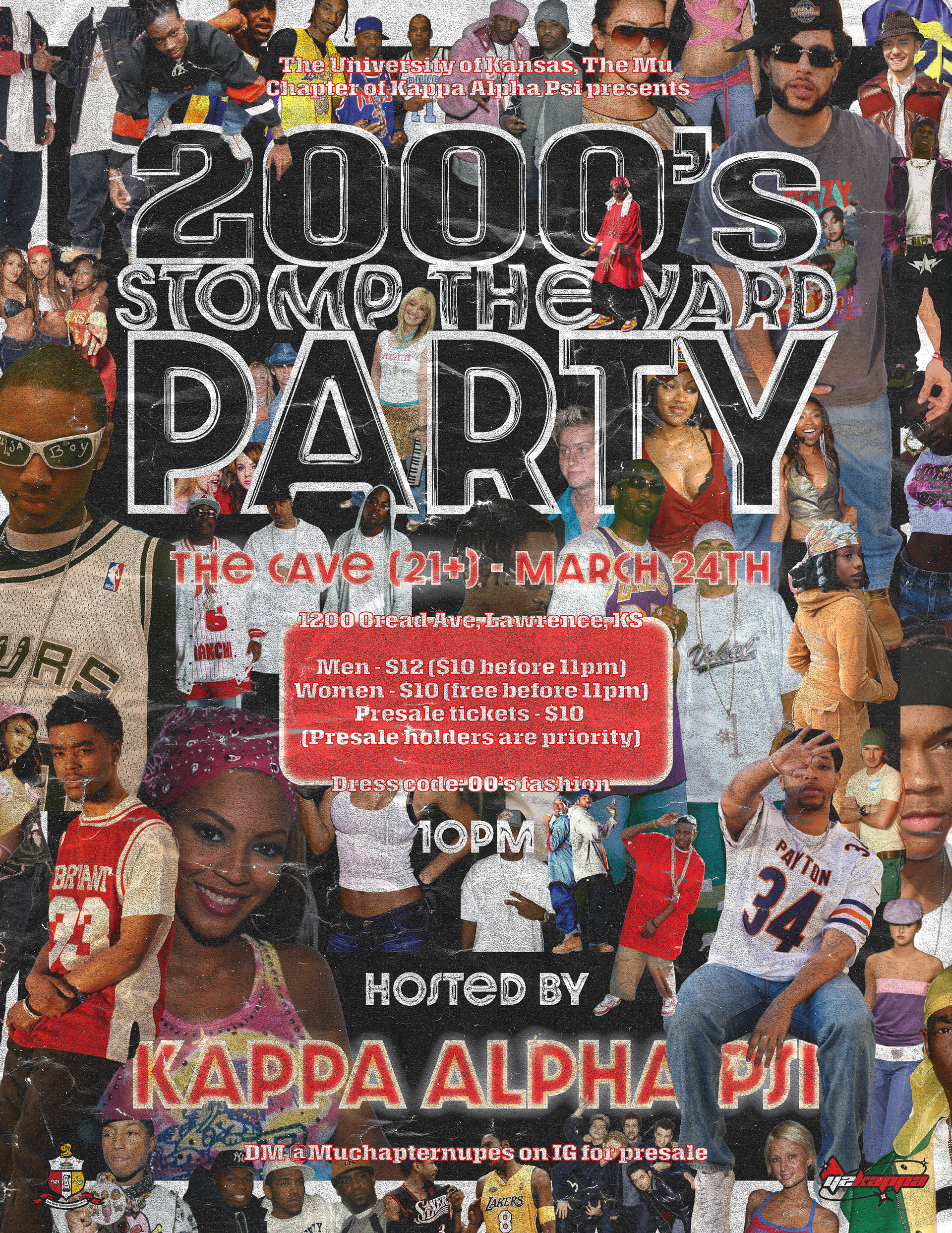

very Pen & Pixel inspired

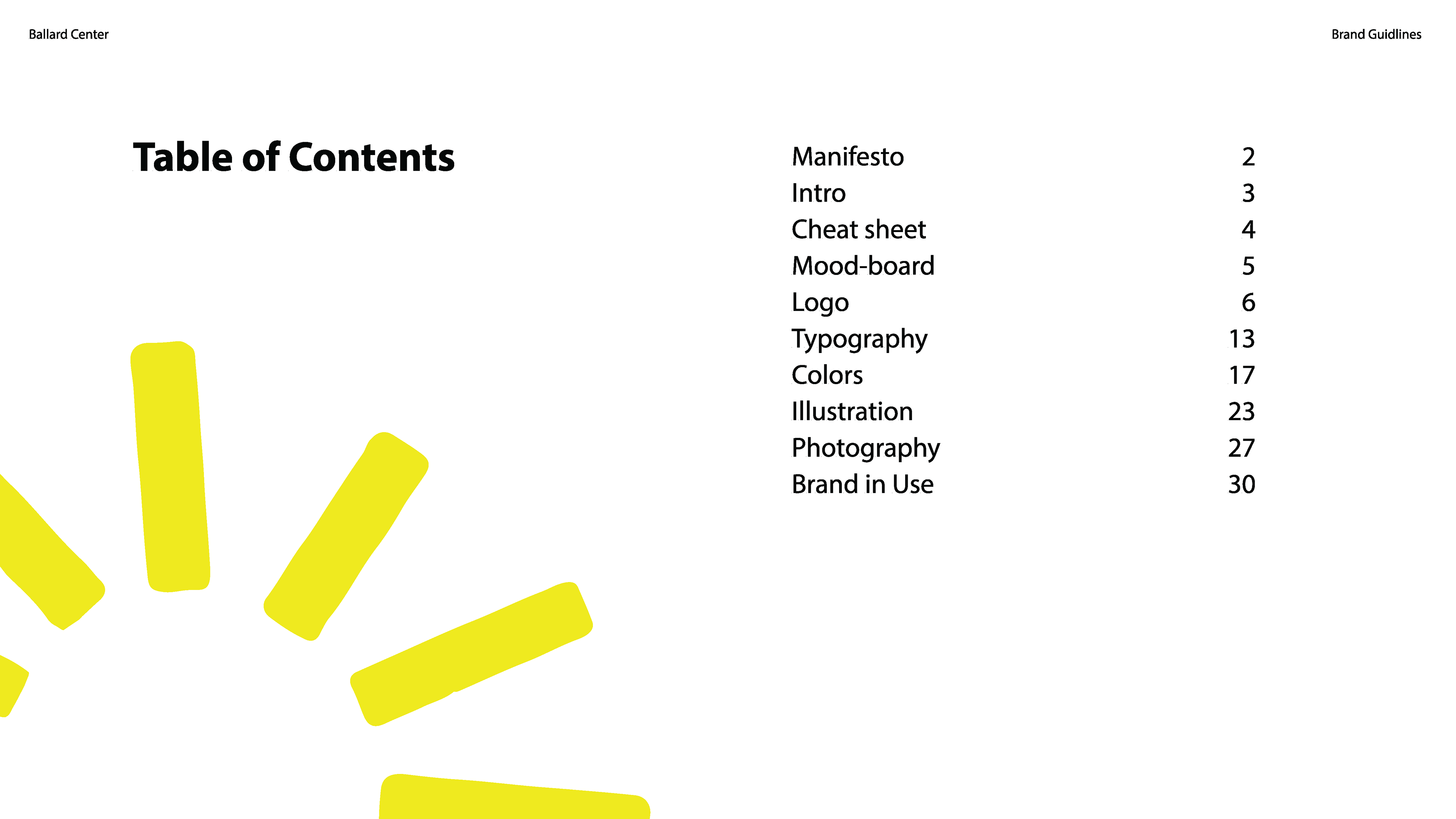
I had the Privilege of helping the Elizebeth Ballard Center with some design needs, including cleaning up some of their logo files, providing other assets and also designing a basic visual standards guide, along with some example deliverables.
